HIDDEN POTENTIAL
THE BRIEF: A war time Etobicoke bungalow kitchen was at odds with its owners. It featured multiple access points and very little counterspace. It lacked storage while the clutter sat atop the cabinets. This kitchen was well past its expiry date. Dull and beige was out. Bright and two-tone was in.
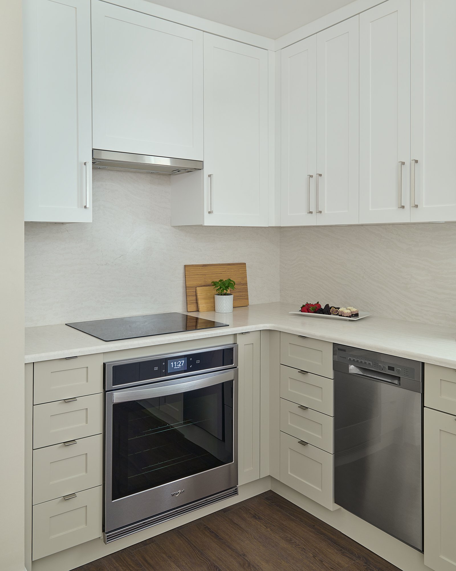
FAVOURITE FEATURES: the undercounter microwave, the ceiling height cabinets for maximum storage, the hidden garbage/recycling centre
by KALLI GEORGE • photos STEPHANI BUCHMAN PHOTOGRAPHY
The conversation started on a cold Wednesday in January. No sooner had our newsletter hit our subscribers' inbox than an email came through. "Kalli, we need to renovate our kitchen." One Zoom call later and a couple of emails, we met at the house. Like many homeowners contemplating a kitchen remodel, the conversation started with IKEA cabinets. More about that later.
C&G had had enough. Their small kitchen was well past its best-before date. This remodel was right up our wheelhouse. We love working on small spaces. Although space is finite, you can rework it into something more functional. There is always a better way.
KITCHEN RENOVATIONS - IDENTIFYING THE PAIN POINTS
The original pain point was the kitchen. The multiple entry points made cooking difficult. The oven placement right by the entry was not ideal. Despite the window, it was still a dark kitchen. With minimal counter space, the couple found it hard to cook together.
Our clients provided an old set of floor plans. It was easy to spot a quick win to realign the entire front of the house and kitchen. This change would widen the kitchen. Expand the foyer closet and open up the entry to the living room.
An odd 4’-0” space lay between the kitchen and the foyer. It served no purpose other than to house a table and mirror. The best use of this space would be to split it between the two rooms.
This home was missing a dedicated hallway. Accessing the back of the house was either straight through the kitchen or the dining room. We realigned the space to create a hallway from the front to the back of the house. The kitchen became a dedicated space with no traffic cutting through it.
KITCHEN REMODEL DESIGN OPPORTUNITIES
The new wall was an opportunity for more cabinetry which, this couple needed. This also meant more countertop space. These two changes made it easier for two people to use the kitchen without bumping into each other.
The new U-shape kitchen offered us the chance to create zones. A coffee zone close to the refrigerator. A cooking zone by the oven and a prep zone by the recycling center. To maximize counter space, we installed an under-counter microwave.
We relocated the dishwasher to the left of the sink. A construction surprise - the dishwasher plumbing was in this location. We found it a little odd about the original dishwasher placement, but this worked in our favour.
KITCHEN REMODELLING - RENOVATING WITH INTENT
Despite its small size, this kitchen has luxuries usually reserved for larger spaces. A garbage recycling centre frees up space below the sink. Luxury quartz for the backsplash and the countertop creates a unified look. Overall, this is a small and calm space.
Cooking is all about movement. The fewer snags or mishaps the, better. There is nothing worse than snagging a sweater on base cabinet hardware when in a rush. We opted for handles on the wall cabinetry and pulls for the base, to avoid these mishaps.
A KITCHEN RENO WITH PURPOSE
About the IKEA mailer – no. This kitchen required a more custom solution. We needed every square inch at our disposal. This route enabled us to add pull-out shelves and size cabinetry to maximize the space.
As for the floor. We did not replace the walnut-stained oak floor in the surrounding areas. We opted for a luxury vinyl tile with a cork bottom that picked up a dark vein from the oak flooring. Where the two met, a stainless decorative strip.
Our starting point for this kitchen was structure and simplicity. It is a transitional space with contemporary touches. It is exactly what this space and couple needed. One will never hear an echo in this kitchen. Nor be dazzled by intricate cabinet doors or crown moulding.
One will feel the vibe of something spectacular in this space. It is designed to perform - not just look good. C&G will love cooking in this kitchen.
Kalli George is the founder and lead designer with Kalli George Interiors’ award-winning interior design team. For more than a decade they have managed the design, build and décor of residential projects across the GTA including, Mississauga, Etobicoke and Brampton.


